October 9, 2026
Analysis
Eurosclerosis or US Decline?
The debate about US and European competitiveness illustrates how narratives of economic decline and triumphalism tend to outrun their evidence

“You’re losing.” This was the blunt message the head of the world’s largest bank delivered to European policy elites in July last year. Addressing an audience at the Irish foreign ministry, JP Morgan’s Jamie Dimon warned that Europe’s global competitive position was eroding, a view he elaborated on in a letter to shareholders this April and at a subsequent Council of Foreign Relations event. His central claim is that “Europe has gone from 90 percent US GDP to 65 percent over ten or fifteen years,” a divergence in economic fortunes he attributes to Europe’s fragmented internal market, “anti-business” regulatory and tax burdens, “rigid labor regulations,” high welfare spending, and high public debt in concert with low growth. By contrast, America remains the “preeminent economy” and “the most prosperous nation the world’s ever seen,” largely on account of the things Europe currently lacks and undermines.
Although Dimon’s claim is bracketed by larger geoeconomic concerns—namely, the need to reverse Europe’s decline in order to bolster a US-led Western bloc in a fracturing multipolar world—it is easy to locate it in the broader “America versus Europe debate” about transatlantic living standards, a marriage of the intra-European “eurosclerosis” narratives of the 1980s (which reemerged during the 2010s eurocrisis) with various strands of American exceptionalism, whose prominence has risen with the temperature of US politics. The debate has gained further momentum since the pandemic, driven by renewed European fears of “falling behind” in the wake of the Biden era fiscal and industrial policies, fears that are being amplified by the ongoing AI investment boom. In late 2024, in a policy document that has come to define elite consensus on Europe, former European Central Bank head and technocratic grey eminence Mario Draghi lent his considerable support to the idea that Europe’s economy has been declining relative to the United States since 1995, on a continuous downward trajectory that is set to continue.1Mario Draghi, (<)a href='https://commission.europa.eu/document/download/97e481fd-2dc3-412d-be4c-f152a8232961_en?filename=The%20future%20of%20European%20competitiveness%20_%20A%20competitiveness%20strategy%20for%20Europe.pdf'(>)(<)em(>)The future of European competitiveness(<)/em(>)(<)/a(>)(<)em(>),(<)/em(>) Publications Office of the European Union, September 2024 In his letter, Dimon exhorted the US to “do whatever it can to help—or even push—Europe [into] adopting the reforms in the Draghi report.”
Indeed, since then it has been scarcely possible to avoid the incessant tropes and memes about how “Mississippi is richer than France“; how Europe’s economy is a “museum,” “mausoleum,” theme park“; how EU regulations stifle innovation, etc. Received wisdom currently holds that American capitalism produces the highest material living standards, whereas, as Larry Summers frequently contends: “Europe is a museum, Japan is a nursing home, China is a jail.”
This is a form of “declinism,” a framework that is comparative and cross-national by default and often built around a notion of “competitiveness” defined in narrow macroeconomic terms. It usually boils down to the following: one economy is falling behind another; relative decline is necessarily bad; arresting and reversing this decline depends on institutional reforms intended to address the initial diagnosis. Or, more schematically: diverging competitive positions create a gap which, over time, affects material living standards and can only be closed by institutionally and politically converging on the benchmark country. One often finds that both sides maintain this essentially zero-sum narrative: one in order to organize a politically preferable reform agenda, the other to avoid an undesirable one.
The validity of this declinist argument relies on representing “falling behind” as a robust stylised fact. This is why, in the case of Europe and the US, it falls apart: most of the confident and widely-circulated claims about their relative economic performance do not survive basic empirical scrutiny and are largely maintained by journalistic and professional research practices that have coalesced around meaningless comparative metrics. And the more specific claim in the Draghi report faces a different, potentially intractable problem: we may lack the data to justify confidence in either direction. This is where the main controversy lies.
At its heart is the seldom-admitted fact that meaningful economic comparison is hard, for two banal reasons: economies can differ in relevant ways and countries measure economic activity differently. As a result, economic statistics can cease to be meaningful for comparative purposes when distorted by significant structural and institutional differences and by the different national accounts methodologies that produce them. This problem is aggravated by uncertainty about the magnitude and the direction of these distortions, especially when they compound over time. And it is further aggravated by economists: there is constant discussion of methodology when it concerns econometric methods, yet less awareness of issues surrounding the compilation, adjustment and conversion of economic data, with many preferring to simply treat them as inputs. MIT’s Olivier Blanchard, a high priest of academic macroeconomics, former chief economist of the IMF and regular Nobel Prize contender, has openly expressed his “total confusion” about the methodological questions at the center of the debate.
Since this debate is about differences in material living standards, any meaningful comparison requires measures that capture relative “real” or volumetric output, and anything that affects measured output without capturing growth in the physical quantities of goods and services is distortive. This is a wrench in the works of any cross-country comparative frame, and, by extension, of any reform program formulated on its basis. In other words, clarifying the empirical limits of economic comparison is not a self-indulgent technical exercise meant to adjudicate the narcissism of small differences between rich countries, but a necessary effort of demystifying a regressive intellectual program that heavily inflects international politics. Put simply, the stakes in the competitiveness debate are real and by no means limited to the North Atlantic. This, then, begs the question of what suitable data do exist and what we can infer from them.
Insufficient metrics
Jamie Dimon’s widely-shared pessimism provides a good starting point. On the surface, “Europe” declining by a whole quarter “over ten or fifteen years” relative to the United States seems like an alarming decline in economic activity—as Dimon helpfully adds:“That’s not good.” But is it the case? The only series that matches these coordinates is nominal GDP expressed in US dollars at market exchange rates (MER), with “Europe” referring to the EU’s twenty-seven member states (EU27).2That is, the total value of goods and services produced in euros and other national currencies is converted into dollars for every annual data point based on that year’s average MER. Instead of saying anything meaningful about the trend in real economic activity, then, the former economics major Dimon has found a convoluted way to say that the euro-dollar exchange rate fell drastically during the same period.3Assuming he’s referring to the nominal GDP from around 2010-12 to 2023, which was the latest data available at the time of his speech in Dublin. This oversight is not uncommon. Elsewhere, veteran Financial Times journalist Gideon Rachman commits the same error, arguing that “America’s economy is now nearly one-third bigger” and that “Europe . . . has fallen behind—sector by sector,” citing nominal GDP figures by the European Council of Foreign Relations, which presents them as evidence of Europe’s “vassalisation” and “relative decline.”
It is therefore more common to use real GDP per capita. When looking at real GDP per capita rather than nominal GDP at market exchange rates, the cumulative change in Europe’s share of US GDP between 2008 and 2024 amounts to a relative decline of just 7 percent rather than 40 percent (a fall of 44 percentage points to just under 4 percentage points). In addition to stripping out volatile exchange rates effects (though expressed in US dollars, the FX distortions are limited to the benchmark year) we’ve adjusted for inflation (each year’s output is valued the prices of fixed reference year) and normalised by population size, which helps to isolate the effects of mere population growth while providing a gauge of average economic conditions. A lot of commentary stops here and calls it a day: real growth rates based on the national accounts adjusted for population size.
But problems remain. The first is conceptual: countries should be compared to peers. Though politically sensible, the EU27 comparator flatters Europe’s relative trajectory, since it contains catch-up economies such as Poland (and other Central and Eastern European countries) which have grown rapidly from a much lower baseline. Although US growth too has been uneven and combined, it contains no regions in which developmental baselines were depressed by a century of war, forced deindustrialisation and communist misrule. An optimal benchmark is therefore limited to the mature economies (which in any case make up the bulk of Europe’s GDP), here referred to as “Advanced Europe.”4A weighted (depending on the denominator of the output variable) aggregate of Germany, France, United Kingdom, Italy, Spain, Netherlands, Switzerland, Belgium, Sweden, Norway, Austria, Denmark, Finland, Portugal.
The second problem arises from one of the most striking institutional differences. These peer economies include what is considered Western Europe, including Italy, Spain, Portugal, Western Central Europe (Germany, Switzerland and Austria), the Nordic countries, and the United Kingdom. What they have in common is what distinguishes them from the US: higher levels of welfare spending and labor market protections. This model involves widespread limitations on working hours per day and per week, as well as provisions for work breaks and paid leave. In the US, by contrast, there is no statutory ceiling on hours, no federal daily maximum, and, unique within the OECD, no statutory minimum paid leave. In 2024, the average worker in Advanced Europe put in 16 percent fewer hours than his US peer—while employed at the same rate.5This is based on the total and not the prime-age population. See below for a chart comparing Advanced Europe to the US on the prime-age employment rate.
The difference is therefore not due to a labour market failure, but instead the result of the US simply choosing to work more and Europe consistently choosing to convert productivity gains into leisure time.6 Evidence suggests that, in Spain and Italy in particular, there is significant informal (i.e. undeclared) work but this is captured in both the GDP and working hours data under the EU exhaustiveness rules. Recent empirical research (coauthored by a contributor to the Draghi report) actually implies a “circular relationship” between hours and productivity, suggesting that higher productivity reduces hours worked and shorter hours raise productivity.7The income channel dominates substitution (“higher productivity reduces hours worked”) and the fatigue channel dominates fixed-cost (“shorter hours raise productivity”). See: Gilbert Cette, Simon Drapala, and Jimmy Lopez, (<)a href='https://doi.org/10.1057/s41294-023-00224-8.'(>)(<)em(>)The Circular Relationship Between Productivity and Hours Worked: A Long-Term Analysis(<)/em(>)(<)/a(>), Comparative Economic Studies 65, no. 4, 2023. To the extent that one of these mechanisms imply diminishing returns to work as a factor driving lower hours, the differences in hours worked is such that if output per hours overstates Europe’s productive capacity, the per capita measure understates it by a greater extent, given the likely elasticity of hourly labor productivity with respect to average hour worked per employee. For a concise review of the literature see: Andrea Garnero, (<)a href='https://ccp.pt/wp-content/uploads/2024/10/garnero_oecd_shaping-working-time-webinar_3-october.pdf'(>)(<)em(>)Working time: economic and social considerations(<)/em(>)(<)/a(>), OECD Directorate for Employment, Labour and Social Affairs, October 2024. Since more hours produce more output arithmetically, it is hours rather than population are the right scale variable by which to normalize. Not doing so risks measuring political choices about the utilization of labor inputs as underlying differences in real output and would violate elementary economic principles according to which labor should be treated as a disutility not just because it is itself exertive but precisely because the value of leisure time is greater than nil.8Marshall’s “real cost” of production comprises the efforts of labor and the “waiting” of capital and he refers to the labor element as the “discommodity of labour,” defined both by the exertion of labor (and “unhealthy surroundings” and “unwelcome associates”) and from labor “occupying time that is wanted for recreation,” or, in modern economic parlance, the opportunity cost of leisure. See Alfred Marshall, (<)a href='https://www.econlib.org/library/Marshall/marP.html?chapter_num=31'(>)(<)em(>)Principles of Economics(<)/em(>)(<)/a(>), book 5, chapter 3.
As it happens, real GDP per hour is also the standard measure of labor productivity. But while it is ideal for analyses of trends within a single country, it does not solve a set of central problems particular to the cross-country comparison: how do we account for differences in domestic prices, consumption patterns, output quality? A common currency like the US dollar is a workable proxy for traded goods, but most domestic consumption is in non-tradables such as healthcare, housing, and education, and is contained in differently composed consumption baskets (different countries’ households spend different shares of their income on healthcare, housing, education etc.).9Around 40 percent of global trade is invoiced in US dollars. See Anja Brüggen, Georgios Georgiadis and Arnaud Mehl, (<)a href='https://www.ecb.europa.eu/press/other-publications/ire/html/ecb.ire202506.en.html'(>)(<)em(>)Global trade invoicing patterns: new insights and the influence of geopolitics(<)/em(>)(<)/a(>), in (<)em(>)The international role of the euro(<)/em(>), European Central Bank, June 2025. In order to say one basket is “more” than another we need a defensible way to translate between them. That is, since prices and qualities for these goods and services differ, we need an exchange rate for equivalent goods that reflects what money can actually buy domestically. Accurate measures of real output and material living standards need to also adjust for different price levels.
This is what PPPs (Purchasing Power Parities) were devised to do. Every few years, the World Bank’s International Comparison Program (ICP) collects thousands of national prices of comparable goods to construct aggregate price-level ratios between countries. By way of example: if a representative consumption basket costs 100 dollars in the US and 80 euros in France, we get a PPP of 1.25 dollars to euro, or, France’s price level relative to that of the US. The bilateral price ratio is then aggregated into globally consistent PPP based on a benchmark price year (the latest year is 2021). So, France’s GDPPPP expresses national output in “international dollars,” a synthetic common unit with the same purchasing power as the US dollar, which in effect tells us how many French euros buy a dollar’s worth of stuff given respective current price levels. In theory, then, we can adjust output for cross-national differences in price levels without exchange rate fluctuations. In other words: it’s like an inflation adjustment, but across space instead of time.
Purchasing power over time
This brings us to the Draghi report. At its centre is a specific claim about labor productivity (that is, GDP per hour) “which converged from 22 percent of the US level in 1945 to 95 percent in 1995,” but since has “slowed by more than in the US and fallen back below 80 percent of the US level” in 2022. At the time of its publication in November 2024, it echoed persistent (and continuing) claims in elite policy circles which construed Europe’s “competitiveness crisis” in terms of the productivity gap with the US, implicating US “dynamism” and, above all, the larger tech sector, while assuming that any future tech-driven productivity boom, such as the “race” for frontier AI models, will pass Europe by.
The measure that Draghi used is GDPPPP per hour in constant 2010 dollars. When reconstructing this productivity ratio time series with data for Advanced Europe, updated with the latest data from 2021, the cumulative decline in output per hour amounts to over 26 percentage points between 1995 and 2024—a continuous downward trend from around 116 percent to just under 90 percent of the US.10Draghi uses bespoke long-run productivity data by Bergeaud, Cette and Lecat from a projected initiated a the Banque de France, which uses difference benchmark years (2010 and 2020 instead of the ICP’s 2011 and 2021) but differs insubstantially from the (<)a href='https://data.worldbank.org/indicator/NY.GDP.MKTP.PP.KD'(>)World Bank constant GDPPPP(<)/a(>) series used in all graphs in this essay. See Antonin Bergeaud, Gilbert Cette and Remy Lecat, “(<)a href='https://onlinelibrary.wiley.com/doi/abs/10.1111/roiw.12185'(>)Productivity Trends in Advanced Countries between 1890 and 2012(<)/a(>)(<)em(>),(<)/em(>)” (<)em(>)Review of Income and Wealth(<)/em(>), vol. 62(3), pages 420–444. The first question that forces itself: is Draghi really claiming that European workers were 16 percent more productive than their US peers three decades ago, as his measure implies?
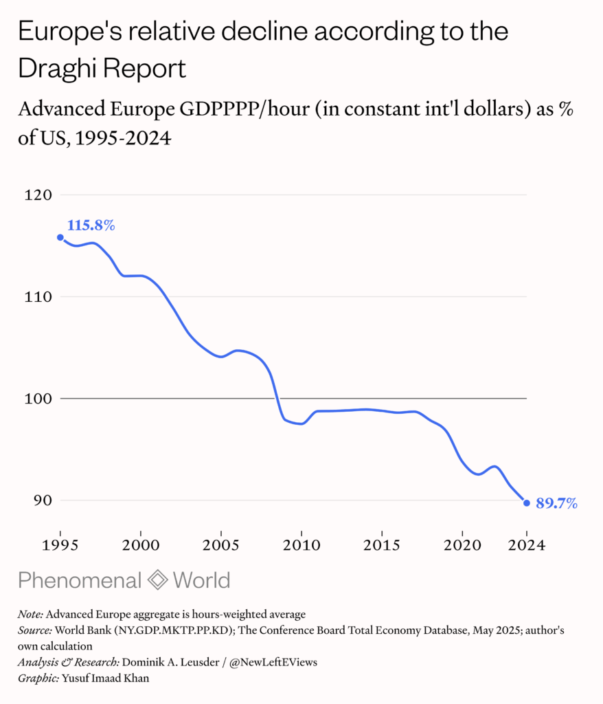
We have to distinguish between two types of economic comparisons: static and trend. In this context, the former is a snapshot of output levels in a given year, shown side-by-side or as a ratio; the latter can either be a comparison of relative trajectories, which show the trend of indexed variables without any information about levels, or absolute trajectories, in which we can compare levels over time.11This is my own ad hoc nomenclature intended to describe spatial international comparisons: despite the nomenclature, “relative” and “absolute” trajectories are both measures of relative performance (in percentages from baselines or at price levels over time). Draghi’s productivity series, along with Jamie Dimon’s and similar claims, are quite explicitly a claim about the absolute trajectory, that is, output as price levels over time. This spring, debate ignited around these claims, particularly around the question of what type of PPP series is most appropriate for this type of comparison, and, ultimately, through which incompatible lens one ought to view the economy: purchasing power or real growth.
Like many economic statistics, PPP-adjusted GDP can be expressed in constant, current or chained prices. All express output in international dollars of a benchmark year, but constant and current are alike in that both are “anchored” to that year: constant PPP series use national accounts real growth rates to extrapolate backwards and forwards from that fixed price anchor without any price adjustments in between benchmark years, while current PPPs use the inflation ratios between countries for every year between benchmarks. Lastly, the chained PPPs, which were especially constructed for the Penn World Table project at the University of Groeningen in response to the shortcomings of both current and constant series, does not have a single anchor but instead updates the relative price weights annually using moving averages.12A 2009 NBER paper had proposed the creation of the chained PPP series specifically for better “intertemporal growth comparisons.” See Simon Johnson, William Larson, Chris Papageorgiou and Arvind Subramanian, “(<)a href='https://www.nber.org/papers/w15455'(>)Is Newer Better? Penn World Table Revisions and Their Impact on Growth Estimates(<)/a(>)(<)em(>),(<)/em(>)” National Bureau of Economic Research, Working Paper 15455, October 2009.
The controversy, which involved Nobel laureates Paul Krugman and Philippe Aghion and other prominent economists such as Bradford J. DeLong and Antonin Bergeaud, arose from the fact that these series imply drastically different relative trends. Unlike Draghi’s constant series, the current and chained GDPPPP per hour ratios do not show drastic decline trends, though they all show similar current gaps (11.8 percent and 7.6 percent between the three of them). Why is this the case? The constant figure makes intuitive sense, if what we want is the trend in output volumes. But there is a known issue with it: it cannot say anything about levels over time.
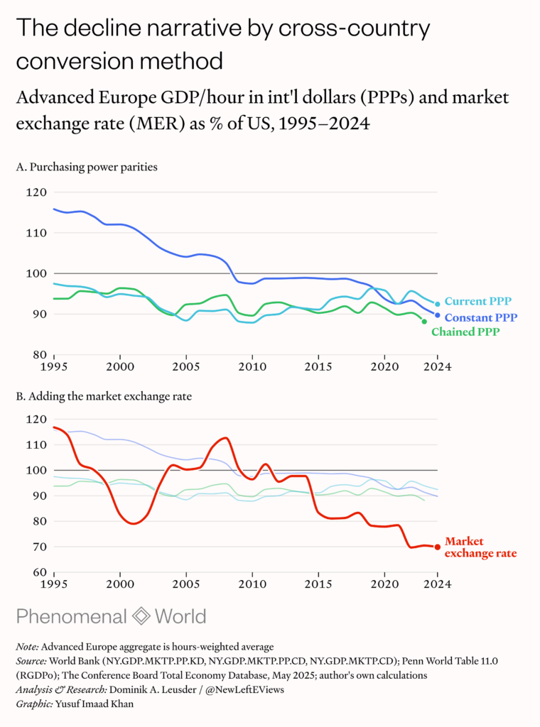
This is a well-documented problem. The World Bank itself, which published its own constant GDPPPP series, provides the following caveat: “To isolate changes in volume it is necessary to select a base year and to extrapolate its relative volume levels over the other years by applying the relative rate of volume growth. . . . Users should note that underlying this method is the assumption that price structures and relatives do not change over time. However, relative prices do change over time and, if such changes are ignored over long periods, a biased picture of the relative growth and development of economies can result.” The IMF doesn’t bother publishing a constant GDPPPP series.
The issue was resurfaced by the writer and Jacobin editor Seth Ackerman in February. It dates back to policy debates that started in the late 1990s about the reliability of PPP benchmarks. The trend implied by price levels captured at benchmark years diverged sharply from the trend implied by annual domestic inflation rates, leading to “jumps” in output levels across different vintages. While this problem, which was always more pronounced for developing countries, subsided somewhat after the improved 2011 benchmark, the method of extrapolating between benchmarks with relative inflation ratios still fails to reproduce benchmarks. That is, the difference between the snapshots of output at relative prices in a country in, say, 1980 and 2000, is, paradoxically, not consistent with the difference implied by the country’s annual inflation rates during the same period. The spatial truth (cross-country price ratios of current prices in a given year) cannot be reconciled with the temporal truth (the historically realized national price path).
The constant PPP construction tries to sidestep this problem by choosing one spatial anchor and trying to preserve the temporal path. But as the economists Angus Deaton and Alan Heston note, keeping prices fixed—by relying on real growth rates rather than inflation ratios between World Bank ICP benchmarks—runs into an arguably more grievous problem when trying to reconcile levels and growth trends over long periods.13See Angus Deaton and Alan Heston, “(<)a href='https://www.nber.org/system/files/working_papers/w14499/revisions/w14499.rev0.pdf'(>)Understanding PPPs and PPP-Based National Accounts(<)/a(>),” National Bureau of Economic Research, Working Paper 14499, November 2008. The economist Angus Maddison had shown that simply using national accounts data to extrapolate from a 2005 anchor implied that China’s 1952 output levels were below biological subsistence—a backwards projection that is not consistent with the historical record.14According to Madison’s updated data, it is generally believed that levels were twice as high. See Jutta Bolt, Jan van Zanden and Jan Luiten, (<)a href='https://dataverse.nl/dataset.xhtml?persistentId=doi:10.34894/INZBF2'(>)(<)em(>)Maddison Project Database 2023(<)/em(>)(<)/a(>)(<)em(>),(<)/em(>) (<)a href='https://dataverse.nl/dataverse/GGDC'(>)Groningen Growth and Development Centre – GGDC, University of Groningen, 2024(<)/a(>). Deaton and Heston conclude that either China’s historical real growth was overstated, and/or China’s 2005 price level was poorly captured. This is the paradox that we encounter when we try measuring relative prices across time: when we try to fix both space and time in order to measure the absolute trajectory the numbers don’t quite add up.
This problem is amplified at the comparative level. To the extent that the benchmarks themselves introduce distortions, there is reason to believe that PPP discrepancies are less relevant when comparing an advanced country to a peer rather than to a developing country. But the extrapolation between benchmarks uses real growth rates, which are derived by national accounts methodologies that are not harmonized across countries. If real growth rates, which depend on inflation rates, differ due to methodology, it might explain why inflation and measured prices at benchmarks don’t align.
Here, the main culprits are the deflators that are used to produce sectoral price indices, specifically those which use “hedonic adjustments” to assess the prices of goods whose quality has increased. And in fact they matter most in the rapidly innovating tech sector: if a computer or a smart phone has seen an improvement in technical specifications without a commensurate increase in its sticker price, what is measured is an effective drop in prices. And, crucially, the US Bureau of Economic Analysis uses hedonic adjustment more aggressively than its European counterparts (which in some cases even use “match-model” methods, which ignore quality changes entirely), including through “double deflation,” in which not just the final output but the intermediate input are adjusted. Therefore, because quality-adjusted prices result in lower measured inflation, the same nominal spending on tech products in Europe and the US shows up as higher real growth—purely on account of methodological differences and not of any real divergence of economic activity.
We do not have a proper accounting of the magnitude of this distortion, though some recent studies suggest it can explain a significant amount of the observed cross-country divergence in output growth.15(<)a href='https://www.sciencedirect.com/science/article/pii/S0147596719300629'(>)Goodridge, Haskel and Edquist (2019)(<)/a(>) find that switching to harmonised deflators closes up to 25 percent of the US–European gap in ICT capital deepening contributions between 1996 and 2013. (<)a href='https://academic.oup.com/oep/article-abstract/57/4/693/2361937'(>)Timmer and Van Ark (2005)(<)/a(>) found that such ICT capital deepening “almost fully explains the US lead in labour productivity growth over the EU during the period 1995–2001. Some recent work by (<)a href='https://www.oecd.org/content/dam/oecd/en/publications/reports/2019/02/measuring-consumer-inflation-in-a-digital-economy_27be403d/1d002364-en.pdf'(>)Paul Schreyer and Marshall Reinsdorf (2019)(<)/a(>) suggests that digital-economy mismeasurement of consumer inflation in advanced economies could add just under 0.6 percent per year to overstated inflation (which translates to roughly 0.6 percentage points per year of understated real growth) by 2015. The crucial point is that, even if these deflator distortions are small, the cumulative gap can compound over time, since real growth rates are used to extrapolate every annual observation sequentially, starting from the benchmark. This is inherent to using year-on-year real growth rates. And in the constant PPP measure, all that the price anchor changes is the level and not the trend itself: the gap implied by the US–Advanced Europe productivity ratio is multiplicatively identical to the gap implied by indexing their real growth rates.
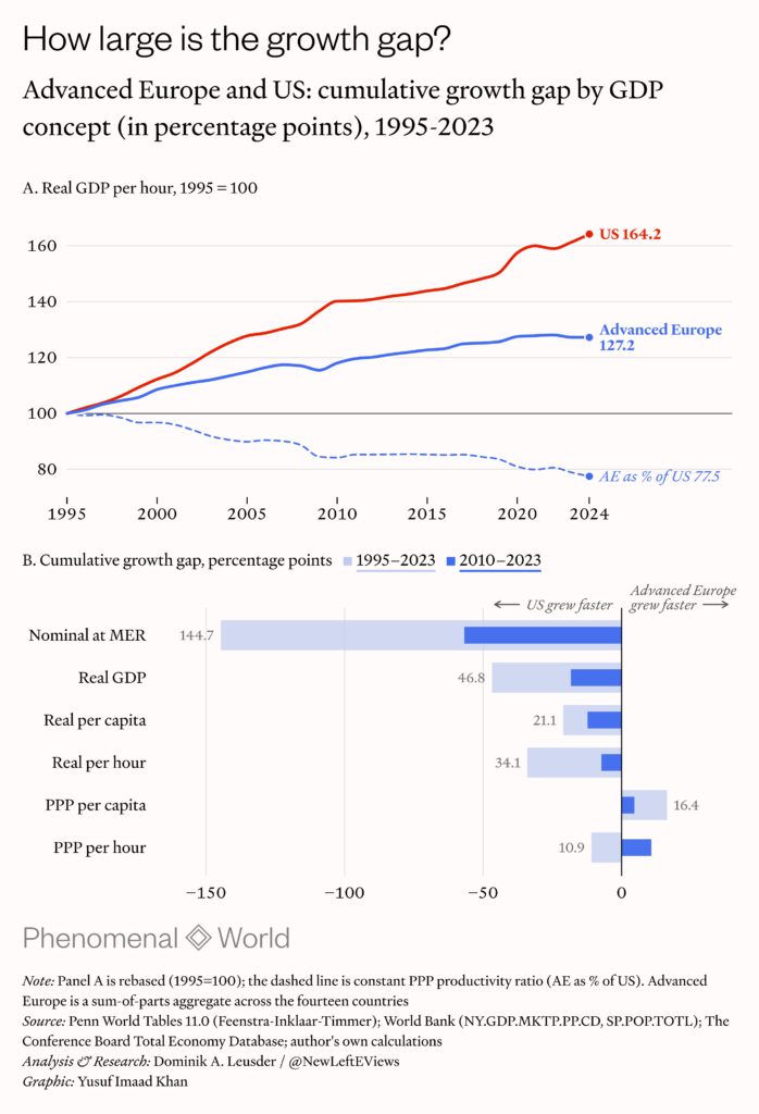
But proponents of the constant measure have argued that their value lies in capturing what PPPs might erode. Bergeaud, one of the authors of the long-run productivity data used in the Draghi report, evokes the Balassa–Samuelson effect, which purports to describe how high-productivity tradable sectors (such as the US tech industry) will produce higher nominal wages, which then raise price levels in the non-tradable sector (in healthcare, education, housing, etc.), which the construction of relative price ratios will adjust for. That is, PPPs in current prices (which extrapolate with relative inflation ratios) make the US seem “poorer” than it is; any “cost disease” symptoms in the non-tradable sector are actually symptoms of underlying productivity growth and wealth, which also implies that the consumption baskets of the US and Europe can’t be meaningfully compared. So, real growth should therefore do the work in determining the relative trend, not relative price levels.16Philippe Aghion, Antonin Bergeaud and Luis Garicano, “(<)a href='https://www.project-syndicate.org/onpoint/paul-krugman-is-wrong-about-us-europe-productivity-gap-by-philippe-aghion-et-al-2026-05'(>)The Mismeasurement of Europe’s Productivity(<)/a(>),” (<)em(>)Project Syndicate(<)/em(>), May 29, 2026
However, as noted by Robert Inklaar, one of the principal researchers behind the Penn World Table: fixed price PPP measures simply cannot be used to make statements about levels over time since they are backward projections and not trends.17Robert Inklaar, “(<)a href='https://github.com/rcinklaar/PPPnote/blob/main/PPP_deflator_comparison_report_revised2.pdf'(>)Comparing PPP Changes with Relative Inflation: Evidence from PWT, Eurostat/BEA, and Official PPP Statistics(<)/a(>),” GitHub, 31 May 2026 That is, they cannot serve as a literal measure of the output at price level in 1995 based on what price levels would end up being three decades later—yet this is precisely what the Draghi report does. What results is an artificial price trajectory produced by imposing future prices onto the past, ignoring changes in the productive structures of the economy, institutional and methodological. This is what explains the implausibility of the updated constant PPP productivity ratio: there is no reason to believe that French workers were more than 115 percent as productive as their American counterparts in 1995 based on what the purchasing power of the US dollar at French and US price levels would turn out to be in 2024.
However, Inklaar also shows that, despite consistency between benchmarks getting better, the gaps between deflators and PPPs persist for the Europe and US comparison—for both GDP and income figures. To recall, PPPs should be relative inflation carried forward, but are not. These gaps since 1995 are negative, meaning that Advanced Europe’s price levels fell against the US more than relative inflation implies. Since the “real” relative Europe–US output level is equal to the real growth differential minus whatever distortion is picked up by the deflator–PPP gap, a flat relative output level would mean that the US’s advantage in cumulative output growth during this period is entirely due to said gap. When observed at the consumer category level (comparing bilateral PPPs to consumer price indices rather than national accounts deflator), it is tradable sectors, which are more subject to hedonic adjustments, that sign negative (PPPs showing European price levels in these sectors relative to the US have fallen faster than inflation indices imply), whereas the harder-to-measure non-tradables sign positive (the reverse, or, PPPs showing a rise in European prices).18Ibid, p.7
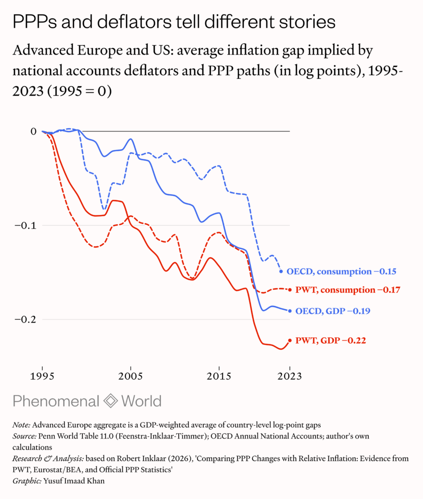
We know, then, that deflators and PPP disagree and that the gap is negative, but we cannot tell which measure is to blame. This would require far more granular data than we have. We are forced to choose whether to view the economy in terms of purchasing power or in terms of real growth, and this choice—which amounts to a choice between current/chained PPPs or national accounts real growth—is based not on established fact but on a reliability judgement about which measure is more reliable and conceptually useful. “Is the gap real?,” “Is the growth differential real?” and, “Did the relative price really move?” are three ways of asking the same question—and answering one forces the answer for the other two.
Measuring affluence in an unequal society
While we cannot say anything about the level path over time with confidence, we can create comparative snapshots of output levels in a given year using current relative prices.19Ibid, p.11: “In joint work with Fernald and Ruzic I have argued that in any given year the best estimate of comparative productivity is the one built on that year’s PPP.” See John G. Fernald, Robert Inklaar and Dimitrije Ruzic, “(<)a href='https://doi.org/10.1111/roiw.12690'(>)The Productivity Slowdown in Advanced Economies: Common Shocks or Common Trends?(<)/a(>),” (<)em(>)Review of Income and Wealth(<)/em(>), 71, 2023. So, in current GDPPPP per hour (in 2021 international dollars), the United States in 2024 is ahead of Advanced Europe by around 8 percent—$98.35 versus $90.91—but remains behind Germany, Austria, the Netherlands, Switzerland, Belgium, Denmark, and Norway.
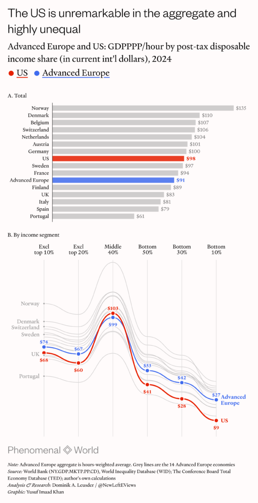
While this is likely the most defensible static picture of relative output levels—and, by extension, following the logic of the declinist debate, of material living standards—it tells us nothing about the distribution. Of course this matters for living standards: to whom are the benefits actually accruing and how does the picture change depending on one’s place in the income distribution? Additionally, one has to consider that the marginal utility of every dollar of output diminishes the higher up the income ladder it goes (as does the marginal propensity to consume, which has further macroeconomic consequences). In welfare-theoretical terms, the more egalitarian among advanced countries are richer.
In addition to adjusting output for differences in hours worked and relative price levels, we therefore also need to disaggregate it by income shares (based on post-tax disposable income). Doing so shows that the US’s moderate advantage is confined largely to the top 10 percent of the income distribution. When this top decile is excluded, the US places below the Advanced Europe aggregate and above only the United Kingdom, Italy, Spain and Portugal, while excluding the top 20 percent places the UK above the US. It is worth noting that, on the evidence of national data, these are countries that have experienced pronounced macroeconomic decline or stagnation over the last decades.
Some have noted that, whatever the country’s high inequality, the US’s middle class is much richer and that a “driving round test” in “McMansion” suburbia will show a level of affluence rarely seen in Europe. But while the middle 40 percent is slightly above Advanced Europe, consistent with the notion of relative middle-class affluence, it is still below that of France, whose presumed high living standards as borne out by the “walking around test” are supposedly illusory. And crucially, the bottom 50 percent and 30 percent of the US distribution are considerably worse off than in any country but for Portugal, with the lower half almost a quarter below the European aggregate and a third below France.
The United States evidently enjoys a high degree of material affluence—but it is very top-heavy. The reason lies in its unusual political economy. To a greater degree than European countries (or other developed countries like Australia, New Zealand or Japan), the US economic model is characterized by lower levels of public goods provision by the state, and high, heavily entrenched rents extracted by professional class middle men: in healthcare, finance, education, legal services, housing, etc. So, while income levels are high, so are price levels, particularly for non-tradable goods and services. The question is, what accounts for what? And how does one account for the role of public services as opposed to market services?
Perhaps what people really care about when it comes to “material living standards” is money in the bank. If so, why even bother with output? Let’s look at income. But household income figures are noisy (subject to cyclical trends, badly reported for poor and rich households, measured quite differently across countries), and in countries without collective insurance and fewer in-kind benefits (pensions, medical costs, thinner welfare nets), savings rates are often not discretionary. That is, higher incomes could simply reflect the lack of social welfare provision rather than higher living standards.
These questions are inseparable from any efforts to interpret US output levels and add to the comparative question in ways that pure output measures cannot. For one, there is the aforementioned notion that adjusting for higher non-tradable prices with PPPs hides evidence of underlying outperformance. What is likely assumed by Bergeaud and others who evoke this in support of defaulting to national accounts data is that the high prices are invariably a consequence of high productivity in the tradable sector in conjunction with wage arbitrage. But there is no empirical evidence that the Balassa–Samuelson effect (which in any case is more relevant for comparing developing and advanced economies) currently exists in ways relevant to the US and Europe comparison. In fact, there is persuasive countervailing evidence: recent empirical research shows this effect disappearing and even reversing from the 1980s onwards among OECD economies.20 Matthias Gubler and Christoph Sax, “(<)a href='https://link.springer.com/article/10.1186/s41937-019-0029-3'(>)The Balassa-Samuelson effect reversed: new evidence from OECD countries(<)/a(>)(<)em(>),(<)/em(>)” (<)em(>)Swiss Journal of Economics and Statistics(<)/em(>), Volume 155, No 3, 2019.
But what is important is that the abundance of evidence points to non-tradables prices being the result of rent extraction. There is perhaps no sector in which this can be seen more clearly than healthcare. The US is anomalous in the amount it spends on healthcare, and, relatedly, in the fact that it is the only country which does not publicly fund its system. As the researcher Karthik Sankaran recently noted, the US spends around 17 percent of its GDP on healthcare, amounting to around 5 percent more than its closest peers, despite worse outcomes in both coverage and results—27 million are uninsured and mortality is higher. These very high prices are the result of very high procedural, hospital and administrative costs, as well as the lack of price lids on pharmaceuticals, and high insurance costs which are not entirely covered by employers. Healthcare spending is therefore a much higher part of the US consumption basket.
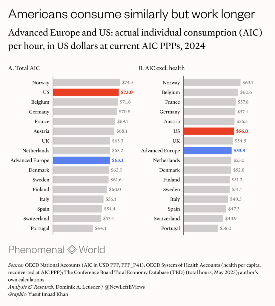
This anomaly allows for a useful comparison. And rather than looking at income, one should look at consumption. Actual individual consumption (AIC) captures what people actually spend, and, crucially, includes informal spending and publicly provided services such as healthcare and education. If we once again adjust AIC for differences in working hours, we find that the US ranks higher than any country other than Norway. But it is precisely because the healthcare system is not publicly funded and costs are higher that the AIC figure is distorted, by a lot of spending that is de facto non-discretionary and simply a reflection of the anomalous price levels. When excluding health from AIC, then, we find the US to be relatively unremarkable, slightly above the European aggregate but once again below France, Germany and others.
Personal healthcare expenditure in the US is in fact extraordinarily anomalous compared not just Europe but the OECD as a whole. In 2023, on a per capita basis, it sits around $5,683 or 68.9 percent above what actual consumption would predict, from an out-of-sample (excluding the US) trendline, compared to 3.4 percent for Advanced Europe. Across the entire population, this amounts to $1.91 trillion. This trend holds in the very long run: comparing annual observations with all thirty-eight OECD countries from 1970–2024, the trend implies a residual of $4984 per person or 52.8 percent or $1.7 trillion overall.
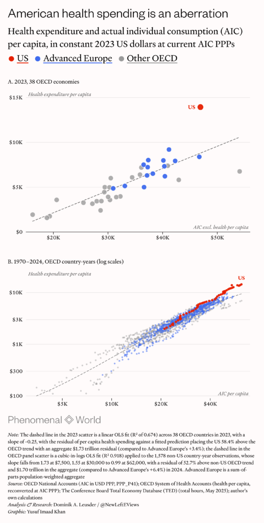
Put differently, because the elasticity (how much spending on health rises with incomes) is essentially 1, this cannot be attributed to the scaling effect of being richer in AIC terms, since the US is robustly over 50 percent above what we would expect. Nor is healthcare a luxury item (which would imply an elasticity greater than 1). Rather, it is a necessity whose costs in the US are widely attributed to cost. As the work of Uwe Reinhardt and others has shown: “it’s the prices, stupid.” In the US, prices per unit of health care are much higher, while utilization of healthcare capacity is near or below the OECD median, despite delivering overall worse outcomes. Therefore, the healthcare sector alone shows that, in the comparative context, higher relative price levels in the US do not necessarily indicate higher relative living standards and therefore justify the use of purchasing power adjustments to output variables.
Why compare?
Perhaps the greatest issue with the declinist discourse is not empirical but conceptual. It reduces global economic relations to competition; it conceives of competition too narrowly as something primarily being between countries rather than firms; and above all, it trades heavily on the assumption that competition is necessarily zero-sum. Together, these assumptions elevate cross-country comparisons of output, income and productivity to the level of policy agenda-setting causal stories, and, with them, the notion that declining in relative terms is inherently at the expense of the country that is “falling behind,” regardless of which side is driving the divergence.
This doesn’t compute. It reflects the neo-mercantilist logic in which the welfare of countries depends largely on what they produce and sell rather than on what they consume. Adam Smith first criticized this model in book four of The Wealth of Nations: “Consumption is the sole end and purpose of all production; and the interest of the producer ought to be attended to only so far as it may be necessary for promoting that of the consumer.” Countries are not like firms that compete for a fixed market, and productivity growth abroad does not make a country poorer because the gains are dispersed by trade and prices; they accrue to both producers and consumers depending not on who is innovating but on how prices shift relative to cost.
The tech sector boom has very much seen prices of high tech goods and services fall. As a result, European consumers and users have pocketed much of the surplus of a boom driven almost entirely by US firms, despite the fact that these firms enjoy moated rents around their digital products in Europe.21 Legally enshrined in Article 6 of the InfoSoc Directive ((<)a href='https://eur-lex.europa.eu/legal-content/EN/TXT/PDF/?uri=CELEX:32001L0029'(>)Directive 2001/29/EC).(<)/a(>) In addition to higher corporate profits, for US workers in that sector, this results in higher product wages—that is, their output valued at what they produce (nominal wages deflated the sector’s production prices). But, as the intractability of the deflator gap problem shows, it is not certain that this necessarily translates one-to-one into their consumption wages or what their earnings buy (nominal wages deflated by consumer prices).
In this context, it’s not obvious why we should lose sleep over relative decline. If California, on account of a tech sector boom and strong population growth, outgrows Michigan for two decades, do we conclude that the latter’s economic model is in crisis, even if, as was the case, it has experienced steady growth and diversification throughout the same period? Who cares? On the other hand, Tuscany’s growth rate relative to that of the mezzogiorno arguably does pose this question, but simply because Italy’s economy as a whole has stagnated for most of the last three decades, while its southern states have experienced periods of strictly negative growth. Surely what we care about is not relative but absolute decline.

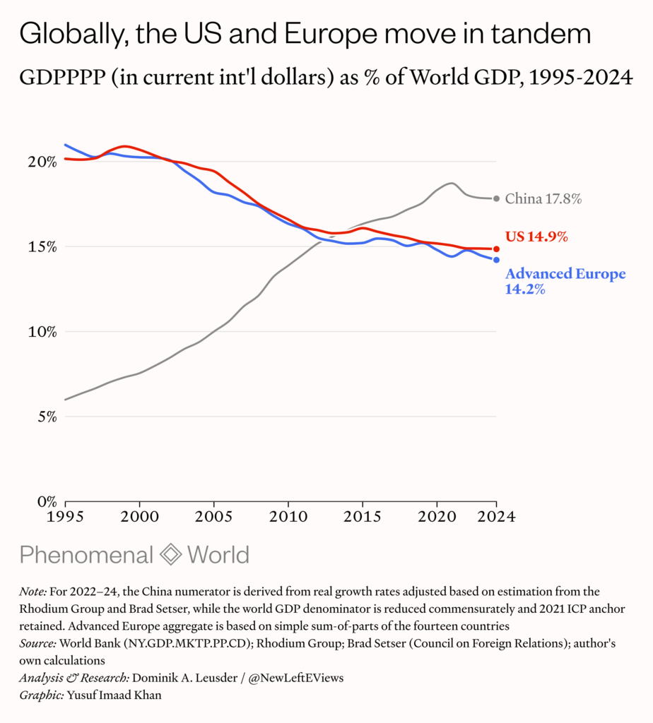
And advocates of the Americophile eurosclerosis thesis surely do too, though they may not realise this: if we examine the trend in US’s and Europe’s shares of global GDP (in current PPP terms since it is a ratio), we find that they trace near-identical trajectories and boast near-identical global economic weight, outsized to their respective shares of global population. We further find that this shift has been driven largely by China, where it has aided a revolution in mass manufacturing and the eradication of extreme poverty. It is only after 2020 that Chinese mercantilism can legitimately be argued to have become zero-sum at the global level—a period during which barely any global divergence from the US and Europe was taking place.22China’s real growth rates are quite likely overstated from 2022. The GDP data in the chart are adjusted based on estimations from the Rhodium Group and Brad Setser.
It is in fact worth noting that the surge in triumphalist rhetoric over Europe over the last decade or so has come in concert with increased American bellicosity towards China. But a broad consensus holds that the advent of the first Trump administration was due to the failure of the incumbent bipartisan system to address economic conditions in which, belied by buoyant aggregates in income and corporate profits and aggravated by successive opioid epidemics and the lackluster recovery after the great recession, many Americans were being left behind.23Shannon M. Monnat, “(<)a href='https://new.legacy.voteview.com/pdf/Election16.pdf'(>)Deaths of Despair and Support for Trump in the 2016 Presidential Election(<)/a(>),” Research Brief, Department of Agricultural Economics, Sociology, and Education, December 2016. If anything, it was China’s domestic stimulus spending and subsequent turn to mercantilism that put a floor under the post-crisis US downturn and global demand for years.24Shahrokh Fardoust, Justin Yifu Lin and Xubei Luo, “(<)a href='https://documents1.worldbank.org/curated/en/838131468239668821/pdf/wps6221.pdf'(>)Demystifying China’s Fiscal Stimulus(<)/a(>),” Policy Research Working Paper 6221, World Bank, Development Economics Vice Presidency, Office of the Chief Economist, October 2012
It is the long-gestating crisis in the social reproduction of the working class (or “middle class” in US vernacular), significantly more acute than in Europe, that is chiefly responsible for the crisis of American politics. However, this is not the theory of decline that its political elites have opted for: implicating the country’s extractive economic model would necessarily entail the kind of reforms that destroy the rents of the very social strata that comprise or fund them. Thus, China becomes the diversionary external threat whose inflation becomes the new organising principle of American foreign policy—until the resulting trade war is lost.
After China prevailed late last year, the focus shifted towards Europe almost immediately. Then, during the crisis sparked by the threatened annexation of Greenland, the debate was reignited; Greenlanders responded on social media to claims they would be better off as US citizens by staging “fentanyl fold” videos, mocking one of the most striking visuals of the opioid epidemic in some of the most blighted areas of some American inner cities, with titles such as “Bringing American culture to Greenland.” The controversy about the Draghi report unfolded in the subsequent months.
While China is the scapegoat, Europe is the foil. Banking on preexisting notions of Europe as overregulated, welfare-dependent and “undynamic,” it is unsurprising that it is above all the populist right and the neoliberal center that have driven “eurosclerosis” discourse, which has come to serve a very specific confirmation bias: there is no better form of market society than that of the United States; what other advanced countries claim is their strength is in fact their weakness; what others claims is the US’s weakness is in fact its strength. As British historian David Edgerton puts it: “Declinism has to be seen as the unwitting last refuge of great power delusions . . . a form of jingoism, a delusion about inherent superiority, dressed up as critique.”25David Edgerton, (<)a href='https://www.penguin.co.uk/books/192782/the-rise-and-fall-of-the-british-nation-by-edgerton-david/9780141975979'(>)(<)em(>)The Rise and Fall of the British Nation: A Twentieth-Century History(<)/em(>)(<)/a(>)
On occasion it seems that this exceptionalist “delusion” is impervious to any amount of disconfirmatory evidence. But in addition to high levels of inequality, compared to its peer economies in Europe, the US economy employs fewer people of prime age, with a poverty rate almost twice as high and an average life expectancy which make it a negative outlier among other wealthy nations. Against this backdrop, focusing on GDP or income measures instead is convenient. But the main victim of this obfuscation is not a wounded European self-image but the ordinary US citizen. As Krugman took to phrasing it: “what happens when Americans realize how miserable we are?” It is implausible that all the Americans who have moved across the Atlantic in large numbers in recent years—reportedly due to high (particularly healthcare-related) costs of living and concerns about quality of life, safety, and stability—believe they are merely being priced-out of a richer country.
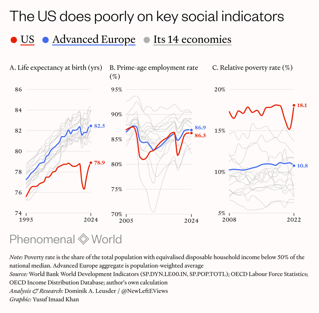
It would, of course, be wrong to forget the European dimension of the declinist debate. It is, at heart, an internal contest between different visions of European reform in which political support is coordinated by conjuring fears of a supposed American productivity advantage that will erode Europe’s social model. Luis Garicano, in a moment of cynical candor, sidestepped the substantive issues by stating that attempts to downplay the gap are “damaging to Europe’s reform agenda” simply because they supposedly undermine reforms that have come to be associated with Draghi. But Draghi’s substantive points have come under critique from elsewhere: the notion, advanced by Draghi and then shortly after given a number by the IMF, that the EU’s internal barriers (regulatory frictions and fragmented markets) are the equivalent of a large self-imposed tariff, has quite possibly also been shown to be a mirage in the data.26See Keith Head and Thierry Mayer, “(<)a href='https://cepr.org/voxeu/columns/no-eu-does-not-impose-45-tariff-itself'(>)No, the EU does not impose a 45% tariff on itself(<)/a(>),” (<)em(>)VoxEU(<)/em(>), CEPR, 13 Nov 2025
Then there’s Draghi himself. While Garicano and others have expressed more frankly that European countries must also loosen labor market restrictions and scale back welfare programs (the very thing that closing the gap is supposed to preserve), Draghi’s tone in the report is more muted. Yet in the 1990s, when he was intimately involved in sweeping neoliberal reforms as the director general of the Italian Treasury, he personally oversaw mass privatization efforts and enforced the budgetary constraints that led to severe cuts in social spending. That Italy became the prime example of dysfunctional stagnation in the advanced world, including posting the worst average per capita growth rate in the world during the 2000s, is in no small part due to the vincolo esterno generation of policy economists that included Draghi.27 See Servaas Storm, “(<)a href='https://www.ineteconomics.org/perspectives/blog/how-to-ruin-a-country-in-three-decades'(>)How to Ruin a Country in Three Decades(<)/a(>),” Institute for New Economic Thinking, June 2019 There is nothing to suggest that his fundamental economic views have changed much since then or that these views have transpired to be anything else than retrograde.
Indeed, much of the economic theory underpinning the declinist position is pre-2008 triumphant market liberalism cased in resin, as evident in the obsession with “competitiveness” and the pathologizing of the European social model, but also in what it omits. When it comes to the productivity divergence discussion of the 2020s, there is little discussion of the demand side and the role of fiscal policy in particular, even though this should merit particular attention in the context of the large pandemic-era spending and investment packages generating private R&D and capital investment—CARES, ARPA, IIJA, CHIPS and the IRA generated close to $6 trillion in federal funding—and leading to tighter labor markets and price pressures.28The Coronavirus Aid, Relief, and Economic Security Act of 2020 (CARES); the American Rescue Plan Act of 2021 (ARPA); the Infrastructure Investment and Jobs Act of 2021 (IIJA); the CHIPS (Creating Helpful Incentives to Produce Semiconductors) and Science Act of 2022 ; the Inflation Reduction Act of 2022 (IRA).
It is hard to dismiss the notion that potential output is elastic to demand: periods of “excess” demand tend to see new capital investment and innovation accompanied by permanent expansion of aggregate supply.29See for instance Gavin Wright, “(<)a href='https://www.cambridge.org/core/books/abs/global-economy-in-the-1990s/productivity-growth-and-the-american-labor-market-the-1990s-in-historical-perspective/04B9D7DFA20E682B0B58AE5A2461863E'(>)Productivity Growth and the American Labor Market: The 1990s in Historical Perspective(<)/a(>),” in (<)em(>)The Global Economy in the 1990s: A Long-Run Perspective(<)/em(>), pp. 139–160, 2010; Paul A. David and Gavin Wright, “(<)a href='https://ora.ox.ac.uk/objects/uuid:fb3c2e53-534d-437a-b5e0-91892010a31c'(>)General Purpose Technologies and Surges in Productivity: Historical Reflections on the Future of the ICT Revolution(<)/a(>),” in (<)em(>)The Economic Future in Historical Perspective(<)/em(>), 2003. The channels are actual capital deepening—firms investing more at full capacity and substituting capital for labor by investing in tech—but also firms being easier to start during booms, as well as more productive firms outbidding others for scarce workers (compositional effects captured as total factor productivity). And the enormous pandemic-era labor market churn (US unemployment peaked at 14.7 percent) will have contributed to workers shifting from less to more productive jobs.
If these channels between demand and potential output are well attested to, then Europe’s weaker record in R&D and fixed investment during the 2010 and can also be viewed, at least in part, as a form of productivity hysteresis resulting from the prolonged austerity and economic slack during the eurocrisis. The issue, then, is that Draghi and others describe the headline trends and lament their effects on trend productivity, but attribute them solely to supply-side and institutional issues; by extension, they view the sectoral outperformance in the US as the result of the ingenuity of tech capital and entrepreneurial vigor, driven by a permissive institutional environment.
Of course, the notion that Europe isn’t capable of innovating is in itself not supported by the facts: less prone to disruptive bursts of innovation, European firms tend to innovate incrementally, which allows them to cement a lead in many high value-add manufacturing sectors. A brief look at the Nature Index, which tracks high quality scientific research output by institution shows the top ten spots dominated by China, with two top institutions from Europe and one from the US. It is likely true that European firms will not produce a “frontier” AI model like China or America on account of insufficient computing infrastructure, but while this is a sovereignty concern (especially since the new Mistral model use Chinese open-source weights), it is not clear that there will be long-term economic fallout, as evidence suggests that near-frontier models can satisfy most of the needs in the European corporate sector (or that widespread AI deployment will even have a significantly positive productivity effect).
New indicators
Even if one assumes, as is robustly plausible, that European productivity levels have moderately declined relative to those of the United States in the 2020s, there is no evidence to suggest a materially consequential decline in Europe’s relative competitive position. Such narratives may be politically expedient, but because they lack an empirical foundation solid enough relative to the confidence of the claims, they end up trading in unexamined notions that are immune to refutation because they serve a purpose in a generalized declinist climate and lend credence to zero-sum “race-to-the-bottom” institutional reforms, which frequently end up serving certain sectors of an economy at the expense of overall living standards in the longue durée.
It would likely bode well for contemporary political discourse if it were divorced from the excessive fretting over competitiveness, a process that could be served by a disciplining of the rhetoric of economic comparison. As noted by Deaton: “Some international comparisons are close to impossible, even in theory, and in others, the practical difficulties make comparison exceedingly hazardous.” In Deaths of Despair, Deaton would go on, along with Anne Case, to highlight different manifestations of social decline, purposely looking beyond GDP and income comparisons. While economic growth will remain important, any reform effort in any contemporary market society currently undergoing some form of decline or stagnation relative to internal baselines—as is in fact the case for the US, Europe, Japan and China—would be rendered more credible if it followed suit in limiting the hazard of comparison.
Further Reading

Histories of Decline
Politics and economics in American “declinism”
American elites have raised the question of US decline periodically for most of the last sixty years. What can we learn from this march of...

A Global Euro
How to internationalize the European currency
A roadmap for internationalizing the European currency

Europe Enters Its Metal Era
What kind of Europe survives a fractured transatlantic military alliance?
This month, Trump entered into formal talks with Russia—without Kyiv’s consent—to settle the war in Ukraine, largely on Putin’s terms. And on Friday, speaking with...