Explore our maps here.
During and after the Great Recession, public funding for higher education was slashed as state budgets imposed austerity measures. Staff and programs were cut and tuition rose; in many states, even by 2018, funding had not returned to pre-recession levels. Meanwhile, enrollment soared. As students locked out of a slack labor market were told they lacked the skills necessary for today’s jobs, the solution to unemployment and wage stagnation was to be found in the pursuit of more degrees at higher prices. The result was the acceleration of what is now a four or five-decade trend in US higher education: the replacement of a public good model with a private consumer model, dependent on tuition financed with federal debt, all justified on the back of supposed earnings increases that fail to materialize.
With skyrocketing prices and ballooning student debt, the private for-profit model has taken hold in even traditional schools, which are seeking to cut teaching costs while retaining students and their hefty tuition payments. Even leaving aside the possible collapse of tuition revenues from nonattendance, forecasts for state budget cuts coming out of the Covid-19 recession are alarming—unless the patterns of the Great Recession are avoided, we can abandon hope of a more equitable, inclusive, or expansive higher education landscape into the 2020s.
Our goal in this study is to help policymakers understand the changing landscape of US higher education since 2008, and to direct attention to geographical areas likely to be the most adversely impacted by continued austerity in higher education. We will do this in two ways. First, we calculate a zip-level measure of concentration—that is, how many higher education institutions are in each zip code, and how evenly enrollment is distributed among them—to ask if the higher education market in certain areas is effectively monopolized (one institution enrolling most, if not all, students nearby) or if there a handful of institutions with similar student body sizes (indicating choice among the institutions). Second, we examine how this concentration has changed since the Great Recession and whether there have been effects on the cost of attendance. For example, do monopolized areas experience higher prices? Accompanying this study is an interactive map, where researchers can explore changes in school concentration and price over time, observe key statistics, and download all of our data.
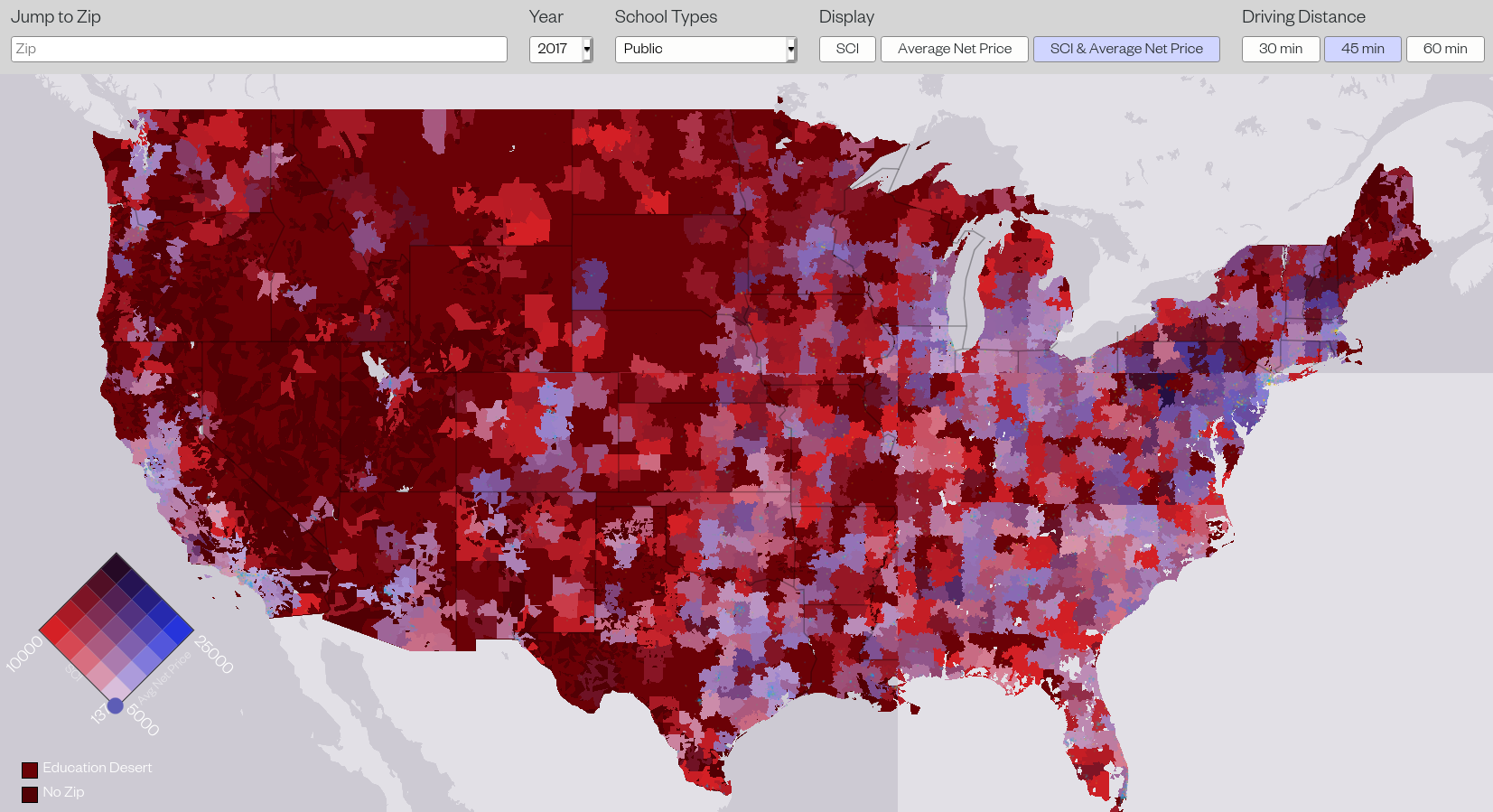
The research we present here builds on a previous report that introduced our school concentration index (SCI). The SCI is a measurement that assesses the concentration of higher education institutions in a given geographical region. SCI varies from 0 (perfectly unconcentrated/competitive) to 10,000 (complete monopoly) to null (education desert). We’ve computed the SCI for every zip in the US and US territories for 2008–2017, including satellite campuses offering degree programs. (The analysis we discuss in this post was completed using 45 minute driving distances around higher ed institutions; to investigate 30 or 60 minute driving distances, explore the interactive map.)
As much research has previously indicated, institutional choice has decreased in the wake of the Great Recession. For all higher ed institutions, regardless of school type, the aggregate count of campuses has diminished, institutional competition has deteriorated (indicated by the concentration increasing), and zip codes considered education deserts have proliferated. These trends are mostly consistent when looking at specific school types as well—while 2-year institutions have been affected more than others, all types of higher ed have suffered these changes. In the below figures we break these stats down, observing all school types together, and school categories and degree types separately.
| All Schools | |||
|---|---|---|---|
| Campus Count | National Median SCI | Ed Desert Zip Count | |
| 2008 | 7062 | 2907 | 3642 |
| 2017 | 6740 | 3357 | 4087 |
| % Change | -4.56% | 15.48% | 12.22% |

Time Trends
The number of campuses has diminished between 2008 and 2017, and enrollment has been increasingly concentrated in larger institutions. These general trends have been driven by a number of well-documented factors:
- The for-profit sector boomed during the high unemployment years of the Great Recession, but it has since gradually lost market share as the typically marginal and non-traditional populations it served (such as older students, parents, and first-generation college students) were more likely to be at work as the labor market recovered, and since its high prices and poor service have generally eroded its reputation with the public. Several large chains have gone bankrupt, generally interpreted as good news for the students they misled and in theory entitling students who took out loans to attend them to have those debts discharged—to little avail, thus far. But that does have the effect of increasing the concentration of enrollment, since the remaining institutions will account for a larger share of all enrollment.
- State funding for higher education declined in the recession and never fully bounced back relative to the demand from students. These funding cuts and the sluggish recovery have prevented new campuses from opening to meet that demand (as they once did), and channeled students into larger classes on existing campuses.
- Traditional institutions began operating on the tuition-driven business model of the for-profits, channeling demand into alternative paths for degree completion and increased online offerings. The corresponding enrollment growth—without expanding campuses or hiring more full-time stably employed faculty—in for-profit-like programs at traditional institutions increased concentration in those institutions.
Our study concludes in 2017, but the trends are clear. Millions are subjected to effectively monopolized higher education markets with diminishing quality. If we split the US population into bins based on the concentration they face (from high competition to monopoly to desert), we see that between 2011 and 2017, more and more people are living in highly concentrated markets. For example, between 2011 and 2017, roughly 2 million people went from having at least two higher ed options down to one or zero in 2017. This trend occurred in every school type, with the worst increases happening in the Associate’s level category, which has seen a 27% increase, from 39 to 49.8 million affected people. Given the ever-increasing costs of higher education, policymakers need to be especially aware of these areas.
| People Within SCI Bins | ||||||
|---|---|---|---|---|---|---|
| School Type | SCI SCI≤2,500 (More than four options for students) | 2,500< SCI≤5,000 (Between two and four options) | 5,000< SCI<10,000 (Between one and two options) | SCI=10,000 (One option) | Education Desert (No Higher Ed Institutions Nearby) | |
| All Schools | 2011 | 223.5M | 48.0M | 25.3M | 8.6M | 4.6M |
| 2017 | 222.5M | 57.7M | 29.0M | 9.9M | 5.1M | |
| % Change | -0.5% | 20.2% | 14.6% | 14.9% | 10.3% | |
| Public | 2011 | 175.8M | 68.9M | 34.3M | 22.8M | 8.2M |
| 2017 | 174.3M | 81.3M | 35.3M | 24.6M | 8.6M | |
| % Change | -0.8% | 18.1% | 2.8% | 7.7% | 5.0% | |
| Private (not-for-profit) | 2011 | 125.6M | 71.7M | 41.1M | 28.5M | 43.2M |
| 2017 | 122.5M | 77.1M | 42.8M | 34.8M | 47.0M | |
| % Change | -2.5% | 7.5% | 4.2% | 22.1% | 8.8% | |
| Private (for-profit) | 2011 | 172.9M | 58.7M | 27.2M | 22.5M | 28.9M |
| 2017 | 143.9.5M | 74.0M | 45.2M | 25.7M | 35.4M | |
| % Change | -16.7% | 26.0% | 66.3% | 14.1% | 22.7% | |
| Bachelors | 2011 | 144.0M | 74.6M | 46.7M | 25.3M | 19.4M |
| 2017 | 128.7M | 93.9M | 53.5M | 27.8M | 20.3M | |
| % Change | -10.7% | 25.9% | 14.5% | 9.9% | 4.3% | |
| Associates | 2011 | 170.2M | 65.9M | 35.0M | 24.8M | 14.1M |
| 2017 | 172.5M | 66.6M | 35.4M | 30.5M | 19.2M | |
| % Change | 1.3% | 1.0% | 1.0% | 22.8% | 36.1% | |
| Below Associates | 2011 | 165.4M | 50.2M | 28.2M | 25.7M | 40.5M |
| 2017 | 149.3M | 64.1M | 32.6M | 34.8M | 43.3M | |
| % Change | -9.7% | 27.6% | 15.7% | 35.3% | 7.0% |
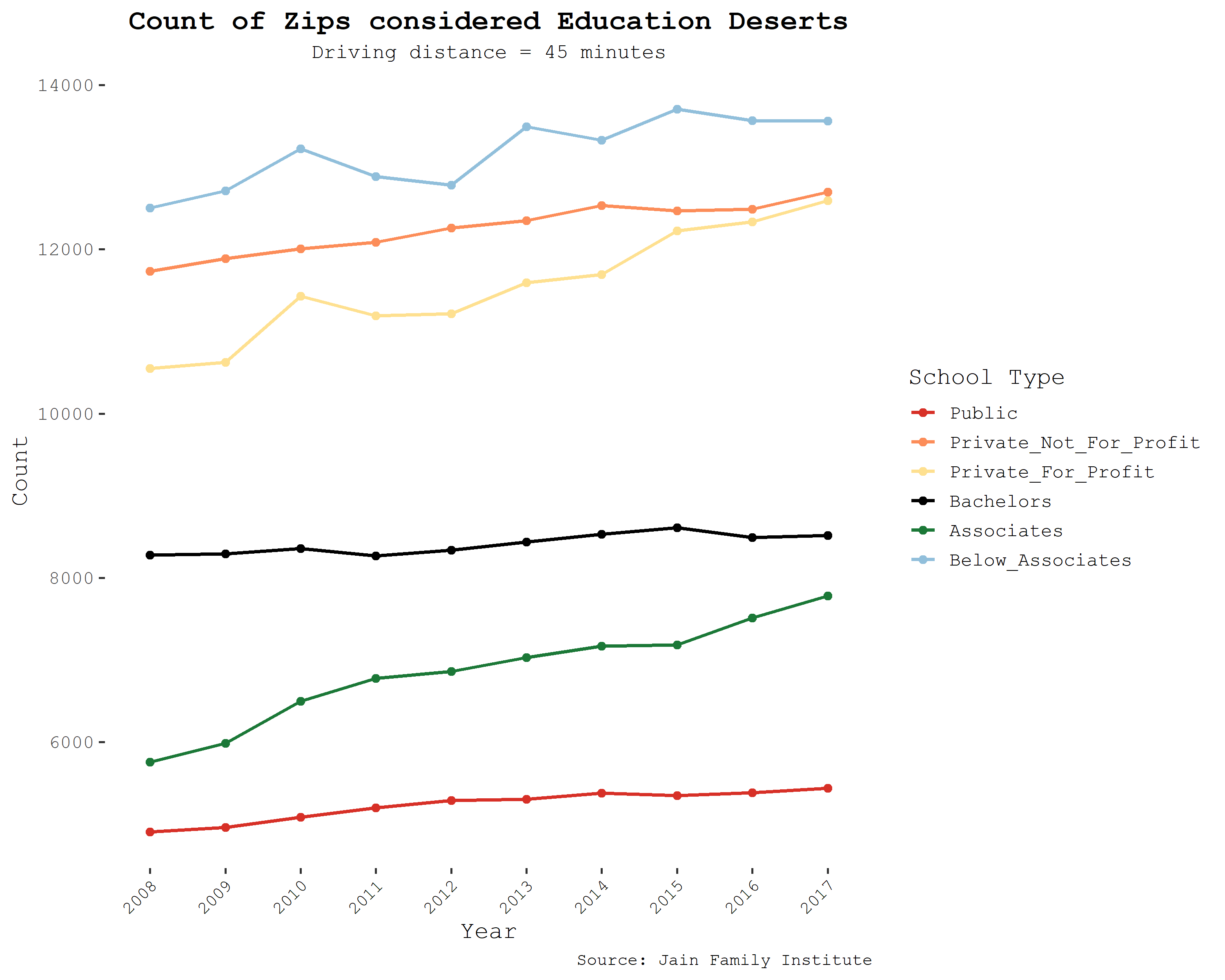
While millions experience highly concentrated higher education landscapes, millions more live in education deserts. These areas, which have absolutely no higher education institution nearby (concentration is null), are particularly worrisome given that over half of all higher education students in the US attend close to their home. Population increases in deserts for public and 4-year college are modest, whereas increases in deserts of for-profits, 2-year institutions, and below 2-year institutions are more disquieting. These are the schools that nontraditional students tend to go to. While it’s arguably a good sign that for-profits and certificate programs have lost some market share since the recession, the fact that this has been accompanied by the adoption of their predatory business models by traditional higher ed means students are probably not significantly better-off.
One response to the evidence about diminishing access for rural and nontraditional students is that online learning offers a flexible alternative to in-person classes. But the recent simultaneous mass experience with online learning as a result of the COVID pandemic shows that—at least thus far—it’s an alternative with significant downsides for learning. To make the picture starker, there is a strong negative relationship between broadband internet access and higher ed concentration. The below table uses 2017 FCC data at the zip code level, showing that both telecom-reported average maximum download speeds and the number of available providers are much lower where education is more highly concentrated.1 Thus, higher education concentration cannot be rationalized with reference to online learning, when that’s made impossible by such unequal broadband service.
This pattern highlights the nexus between concentration in one sphere of the economy and concentration in another. Just as telecoms oligopolists fail to provide reasonable service outside their most profitable areas, private higher education institutions are unlikely to provide access to high quality education to the communities who need it most. In either case, competition need not be the sole remedy—a high-quality, low-cost public provider has been proposed as a way to guarantee universal service for broadband, and may do the same for higher education.
| Average Maximum Advertised Downstream Speed (Mbps) | |||||
|---|---|---|---|---|---|
| SCI SCI≤2,500 (More than four options for students) | 2,500< SCI≤5,000 (Between two and four options) | 5,000< SCI<10,000 (Between one and two options) | SCI=10,000 (One option) | Education Desert (No Higher Ed Institutions Nearby) | |
| All Schools | 198.12 | 134.65 | 129.00 | 113.31 | 105.65 |
When we divvy up zip codes into regional categories, we can observe further discouraging patterns. Everywhere, regional concentration has trended upwards. The Rocky Mountains, Plains, and Southwest regions have the highest region-wide median concentrations and have also seen the steepest increases since 2008. In 2008, the Rocky Mountain and Plains regions had median SCIs of 4,466 and 4,179 respectively; by 2017, those statistics had jumped to 7,532 and 5,893. There are no blanket explanations for the increase in regional concentrations. In some regions, like the Rocky Mountains, campus counts and enrollment increased over the time period, indicating that even though there has been a response to increasing demand, that response has been insufficient (and in many cases comes from the for-profit sector). In others, like in the Southwest and New England, campus counts decreased while enrollment increased, indicating that students are clustering in established higher ed programs. Remaining regions have seen decreases in both campus count and total enrollment; most likely a symptom of the shrinking college-aged population. Experts have predicted certain areas will fare worse than others moving into the 2020s, and trends herein support these claims. The cartograms below show the change in SCI in the US over the years of analysis. States are sized according to aggregate enrollment for that year.
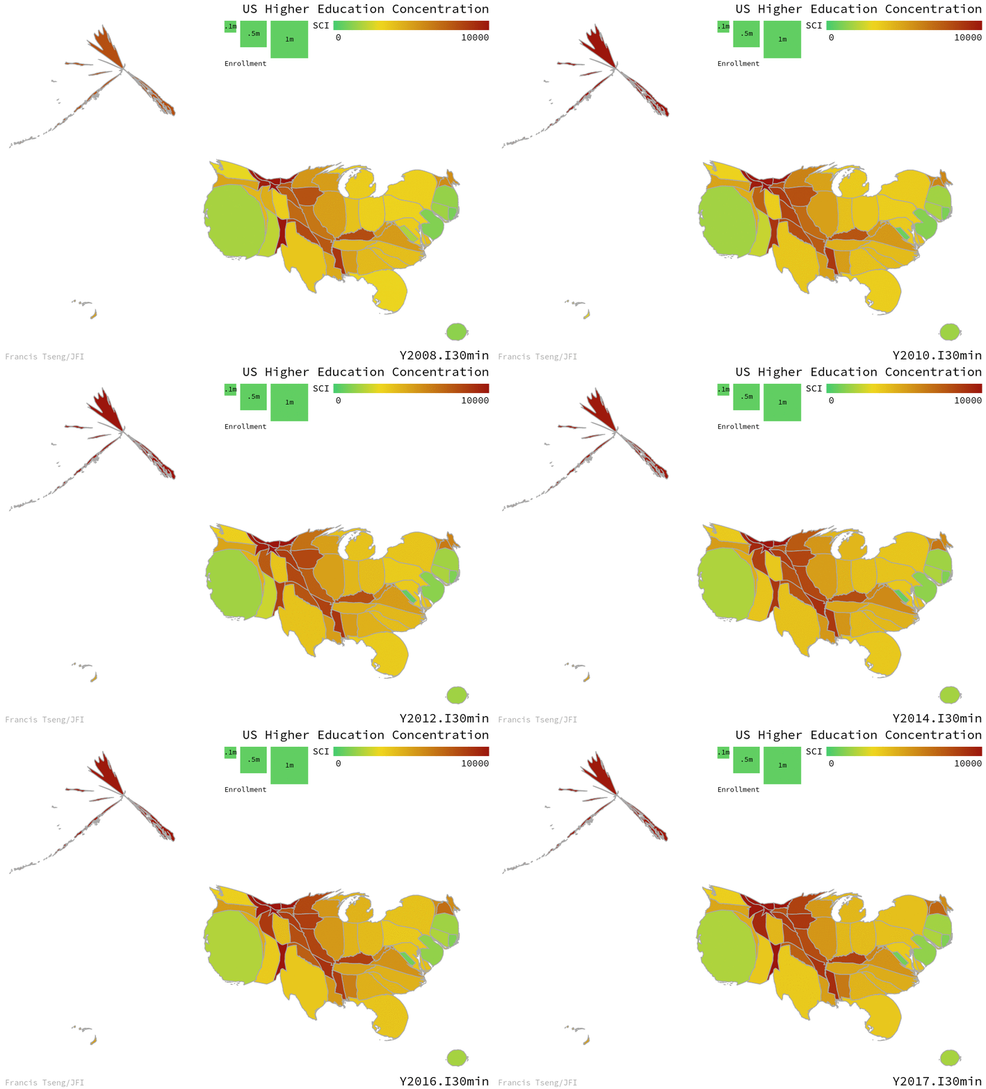
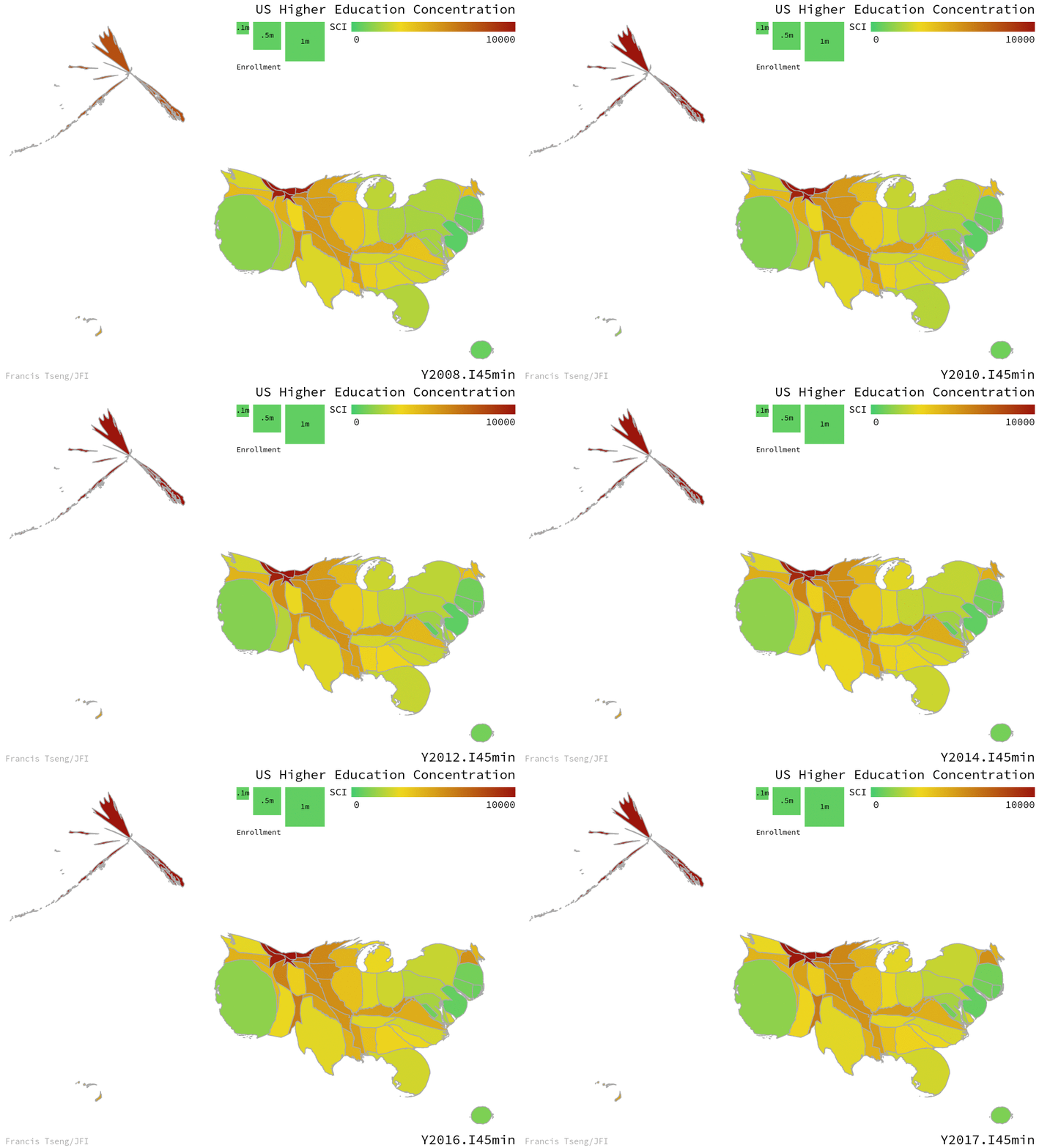
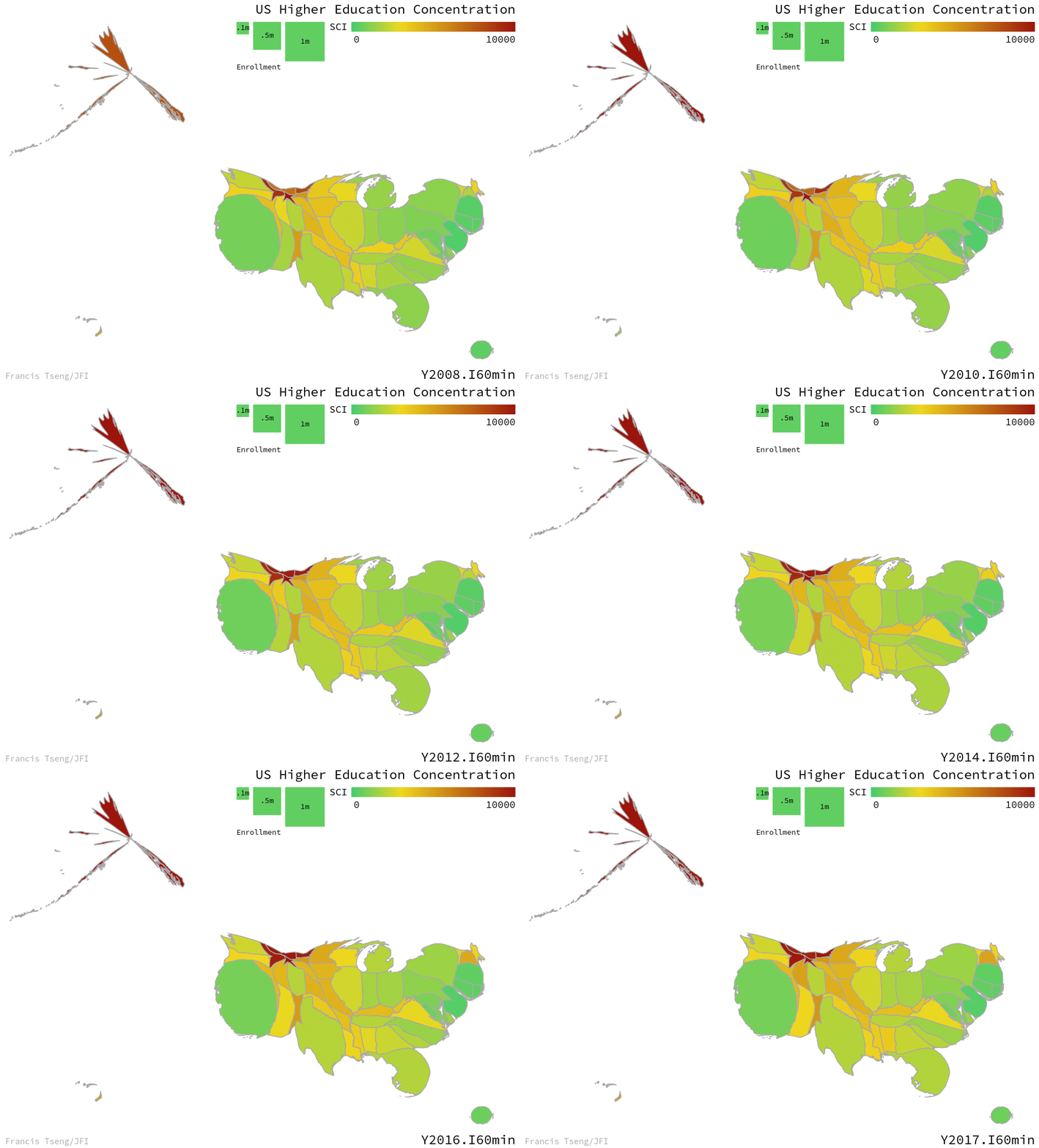
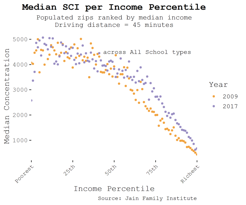
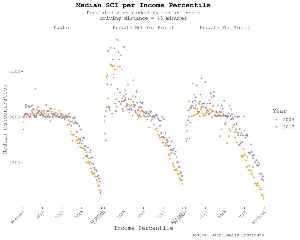
Splitting up zip codes according to where they lie on the US income distribution also reveals interesting and persisting patterns. Richer zip codes are subject to lower higher ed concentration, but by 2017, even the richest zip codes are experiencing more concentrated higher ed markets, likely to worsen as the markets contract further after 2020.


As concentration has risen, so have prices—both tuition and fees as well as the “net price” of attendance, including financial aid and additional costs such as housing. This too is caused by the gradual withdrawal of state aid and the de facto privatization of much of the higher education landscape to look more like the for profits—subsisting on tuition, and designed to proliferate costly degrees would-be students feel pressured to obtain.
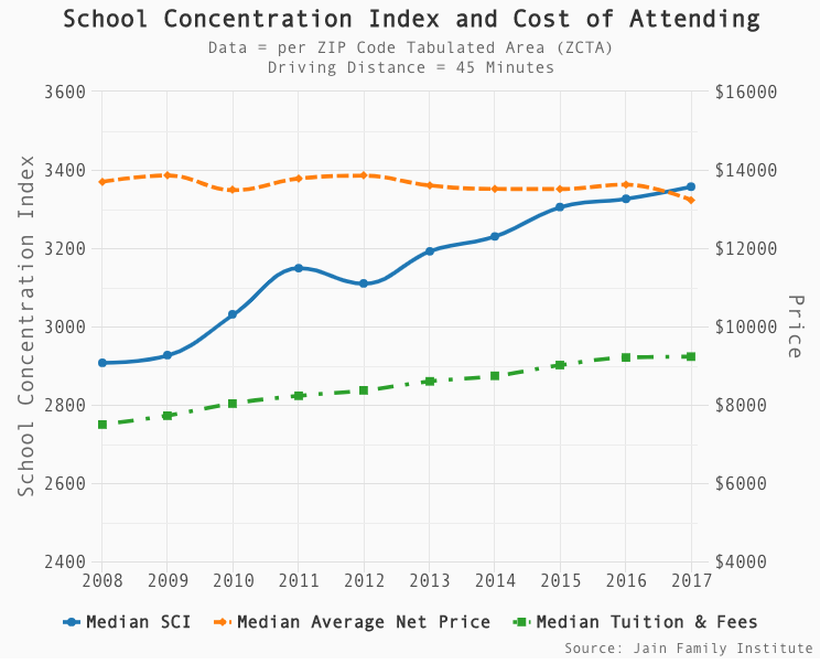
Time series of SCI, tuition and fees, and net price, across zip codes over time.2
Regression Analysis
We can interpret the time trends in part because we already know a good deal about the trajectory of higher education policy, enrollment, and attainment, as well as broader economic conditions. But to isolate the effect of local school concentration, we undertake a further regression analysis.
Specifically, our level of observation is the zip code. We attribute higher education-related variables to zip codes using the concept of the driving distance, and we obtain demographic and economic data on zip codes from the American Community Survey. We are thus able to ascertain if there’s a relationship between the school concentration index and the cost of attending college, by zip code, conditional on controls. We use a two-way “fixed effects” specification to filter out both static zip-code level effects (which might include things like urban versus rural as determinants of both concentration and, potentially, cost of attendance) and a time trend (which would filter out the aggregate dynamics referred to in the previous section). We also control for zip code median income (which can vary over time and so is not redundant with the zip code fixed effect). The idea is that remaining within zip code, over-time variation in SCI and cost of attendance would be unlikely to be driven by some omitted variable, though of course, that assumption is highly contestable.
In this analysis, we find there’s a residual positive relationship between concentration and cost of attendance: people in zip codes with fewer institutions pay higher prices, conditional on those controls.
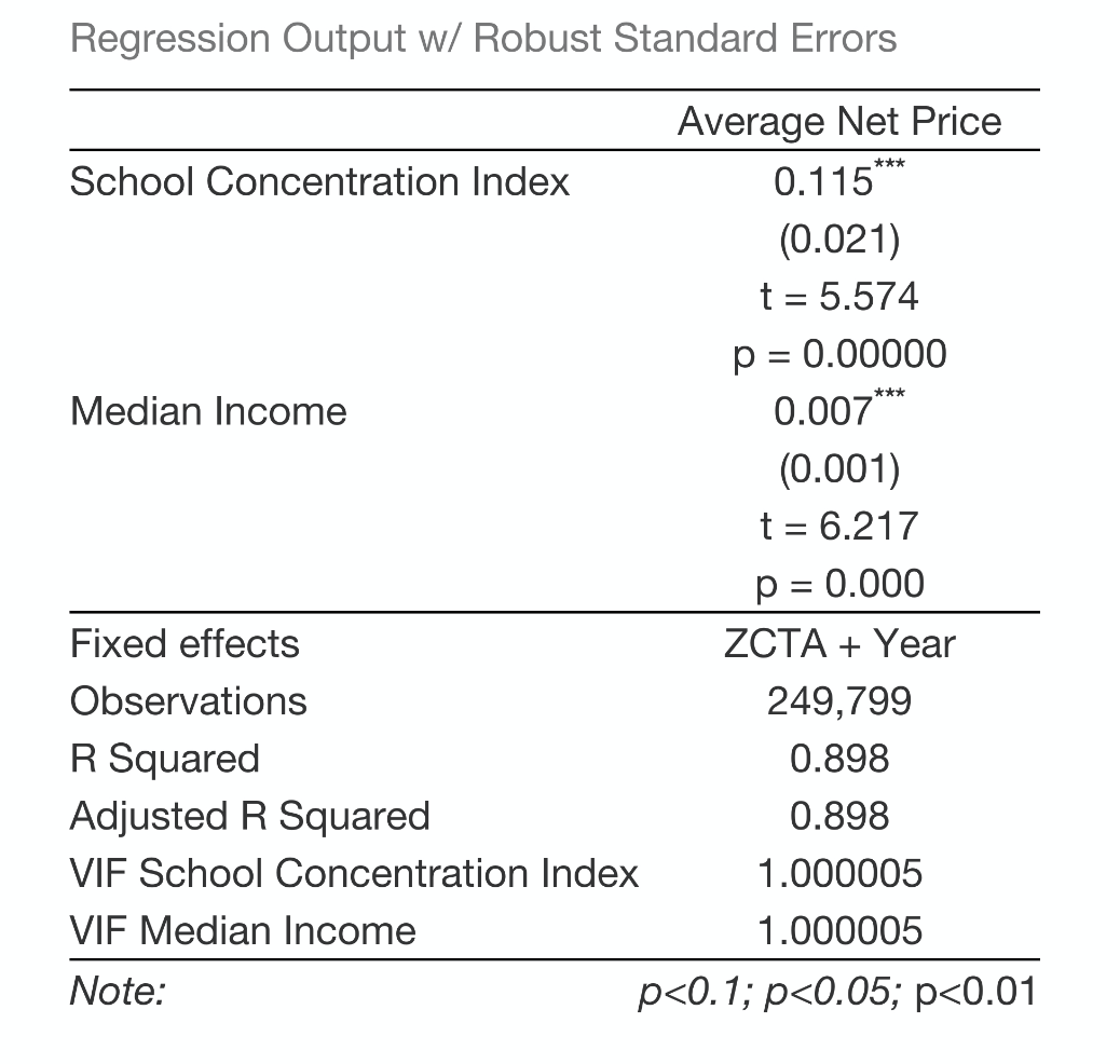
Regression output.3
Regressions of price on measures of concentration have a fraught history in the literature on Industrial Organization, the branch of economics that deals with firms, markets, and industries. The question is how to interpret findings like the one we have in this case: more concentrated markets have higher prices. Is that because the (fewer) firms in those markets have greater market power and can use that power to set prices in the absence of competition? Or do firms that achieve higher market share do so because they are more appealing to consumers, and can therefore “get away” with charging higher prices? Higher education likely falls into the category of differentiated goods, in which firms (in this case, colleges and universities) are offering something unique to the public and are therefore not necessarily directly in competition with each other, although if a firm sets too high a price, its customers might be induced to switch to another. Industries with differentiated goods are typically thought to have some amount of market power—the question is whether higher concentration means those industries are less competitive, or more competitive (and to the victor go the spoils, so to speak).
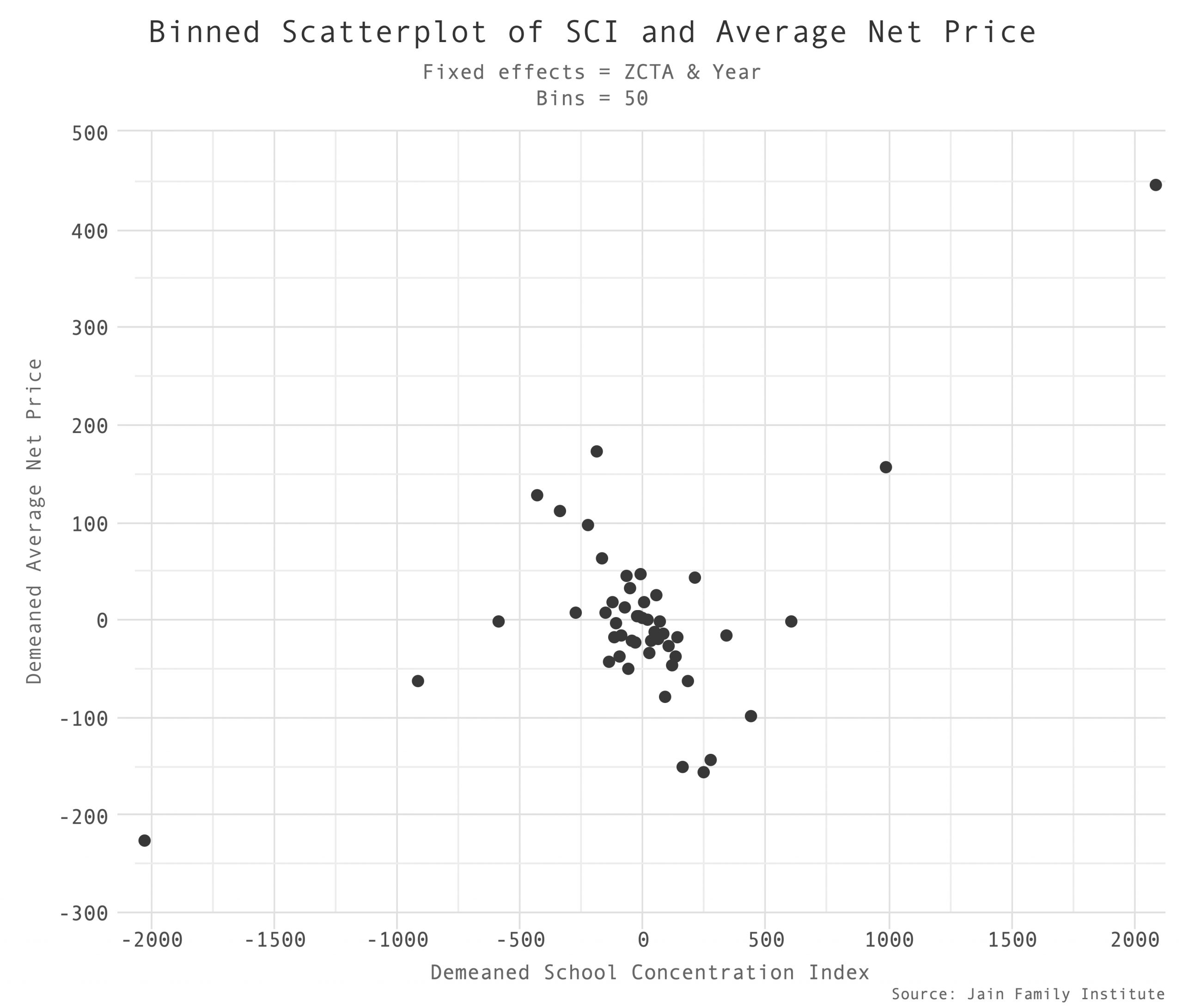
Binned scatterplot of average net price on SCI.4
One way we know there’s significant market power in higher education is the enormous degree of price discrimination. Relatively few students pay sticker price, and most are given a financial aid package that is tailored to them and their circumstances and therefore not available to another student. (Among other things, one student can’t “sell” their financial aid package to another.) Colleges most certainly tailor their offers to their assessment of how likely a given student is to be able and willing to pay a given level of tuition. Colleges typically present this price discrimination in egalitarian terms: students who are more able to pay pay more. But the reality is that students with fewer alternatives pay more—and those students are, in fact, the disadvantaged ones. The overall disposition of financial aid policies has shifted from the egalitarian to the discriminatory as part of the overall trend toward privatization, as evidenced by declining enrollment by students from more disadvantaged backgrounds at the state flagship institutions that were historically the most conducive to social mobility of any portion of the higher education landscape. Institutions are less in the business of redistributing higher education from rich to poor than they are in the business of charging what the market (and each customer) would be willing to pay for a given degree, and to induce them to buy more degrees at higher prices.
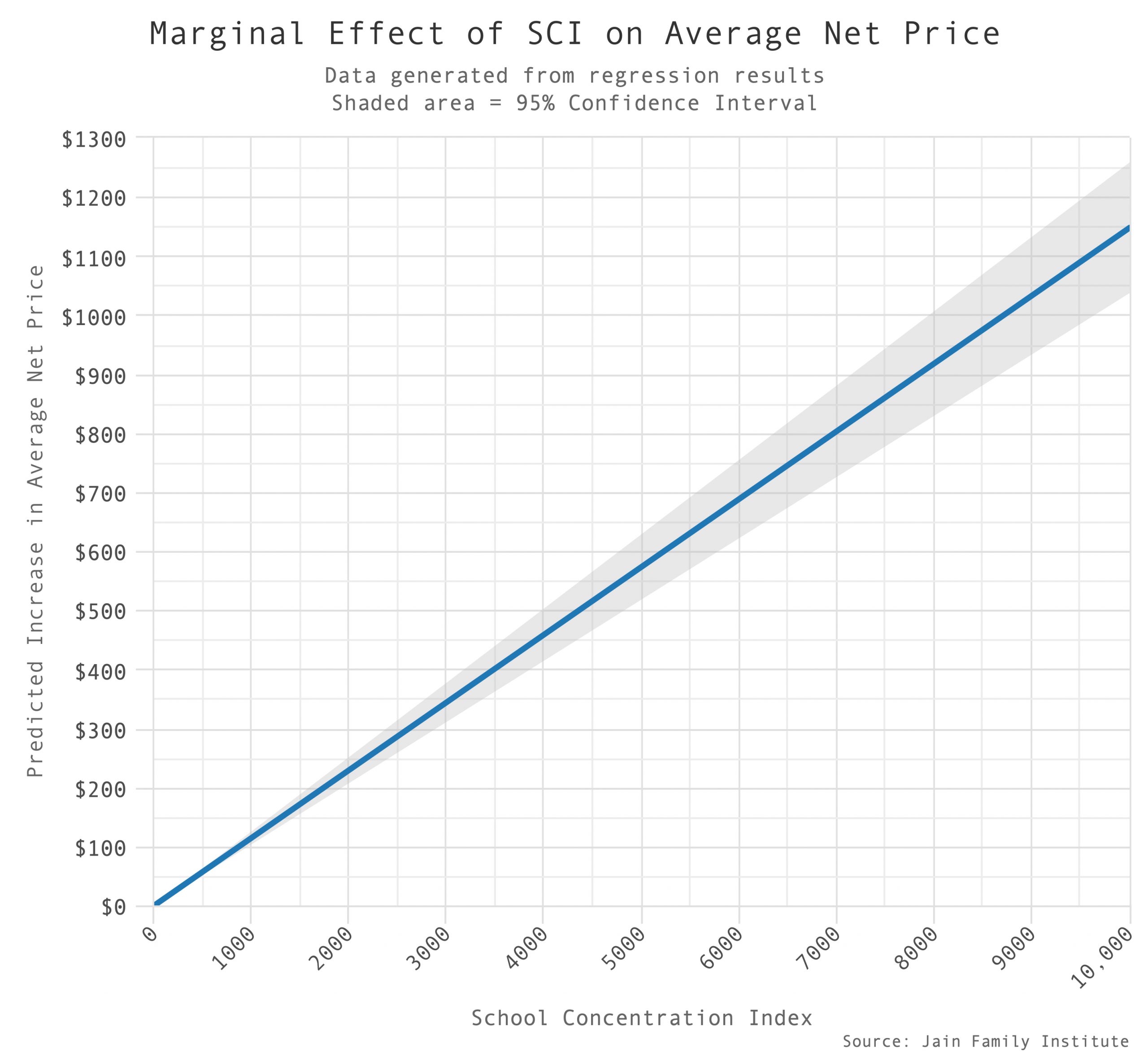
Marginal effects analysis of the previous two way fixed effects regression.5
All of this suggests that market power in higher education is an important and under-studied phenomenon. Here we present a fairly crude measure of market power—school concentration—that nevertheless appears to be at least correlated with outcomes we’d expect it to be. We can thus go one (small) step further toward interpreting the time trends we started with: concentration is increasing, and so are prices. The one may have something to do with the other.
Footnotes- It bears noting that the chart lists speeds as reported by telecoms to the FCC. Numerous reports, including one by Broadbandnow, estimate that actual speeds are in fact much lower, averaging 25Mbps in rural areas and 100Mbps in urban areas. Another recent report by Microsoft found that 157 million people “do not use the internet at broadband speeds.” Even with the possibly inflated telecom-reported numbers, we can see a negative relationship between school concentration and internet quality.
- This figure shows that as state funding for higher education declines (on a per student basis) and the previously-booming for-profit sector has diminished, concentration and tuition and fees are increasing, while net price is approximately constant. Traditional non-profit institutions have figured out how to expand enrollments on a for-profit-like, tuition-heavy business model, increasing concentration. The constant net price is probably driven by two dueling trends: rising prices at traditional institutions, and declining enrollment at historically more expensive, for-profit institutions.
- Two-way fixed effects regression of average net price on concentration, zip code median income, and zip code and year fixed effects. The estimated coefficient on concentration is positive, indicating that zip codes that are more concentrated, on average, face higher net prices.
- Includes the controls for zip code ID, zip code median income, and time. This depicts the regression output graphically.
- This chart is to be read as follows: According to our estimated relationship between zip code SCI and average net price, increasing SCI from 0 to 10,000, i.e. the entire range, would be associated with increasing average net price by about $1150. The shaded gray area depicts error bars around these estimates.
Filed Under
